
VicRoads
In 2020, the global pandemic hit so VicRoads (as well as many other government organisations) had to digitise many features and transactions.
As the Lead UX Designer at VicRoads, I created experiences for 8 new digital initiatives during COVID-19 to enable customers to complete Registration & Licensing transactions online, including access demerit points online.
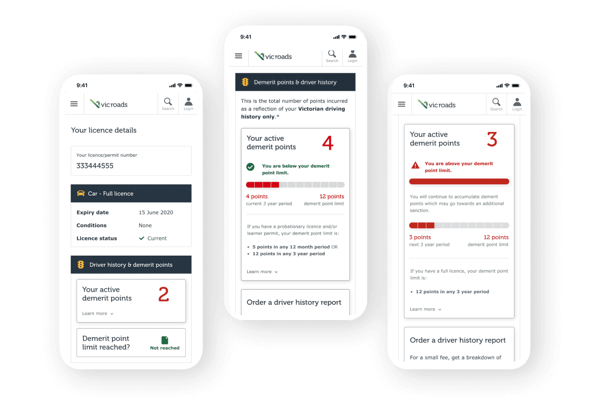
Prior to this, VicRoads customers could only access their demerit points by calling the the support line. Our goal was to create a digital experience within their online account to help them quickly access this information.
In addition, many customers were confused at how demerit points actually worked so we worked closely with the content and legal team to create user-friendly descriptions throughout the designs.
My contribution
User flows
Wireframing
User testing
Web design
Mobile design
The team
1 x Lead UX Designer
1 x Product Owner
2 x Developers
Year
2020
Creating personalised experiences for users (14 different scenarios) due to variations of licence types, vehicle types, and demerit point limits
Developing interactive mobile prototypes on Figma to be used for usability testing
Moderating two rounds of remote 1:1 usability testing sessions (10 participants in total) via Askable
Annotating components and modules on Figma to support our business analyst in documentation of requirements and functional specifications
Presenting demerit point designs and customer testing findings at bi-monthly Digital Showcases with the Registration & Licencing teams (over 80 attendees)
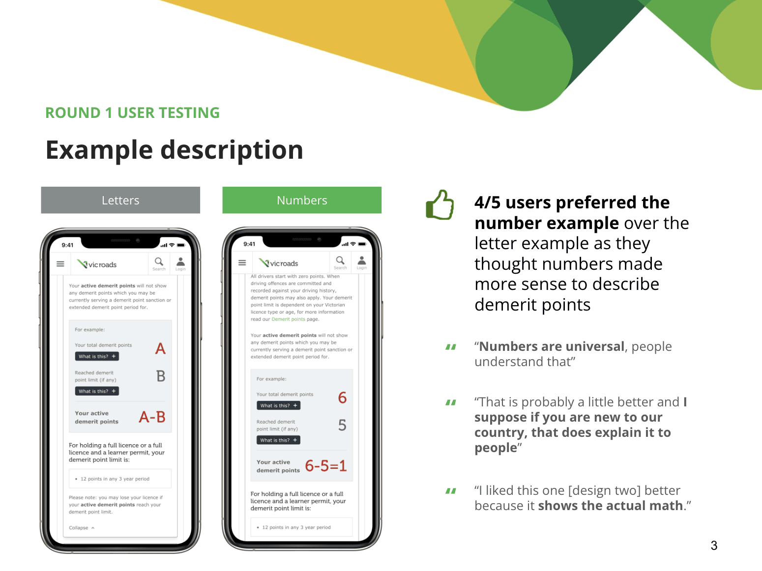
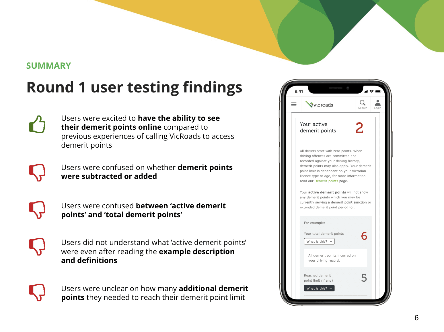
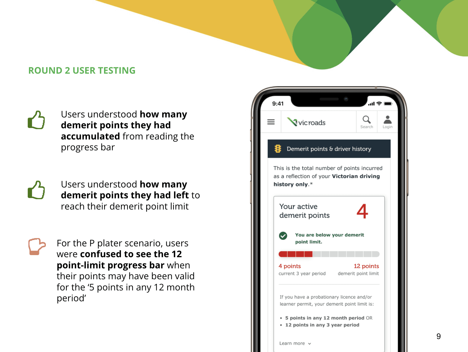
Create visual graphics to make it easier to understand
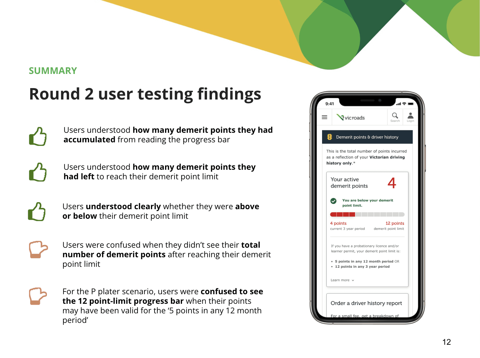
We created a progress bar graphic to make it clear to the customer how many demerit points they had before they could reach the limit. When we tested the experience with only letters or numbers, it was really confusing with the customer and they did not understand the concept of demerit points, so adding a visual cue helped immensely.
Use clear wording
Designing for all types of demographics and age groups means using clear and concise wording and language. Our goal was to make it as easy as possible for those who owned a licence. If there was a difficult word used, we asked the legal and finance stakeholders whether there was another word we were able to use to replace the jargon.
Design for diverse groups
We recruited and tested our designs with a range of diverse groups including people who were and were not tech-savvy, people who spoke English-as-a-second-language, people who varied in age, and people who had different platform preferences (e.g. phones, laptop, tablets). Our goal was to ensure the designs were seamless for all types of users, so they could complete the transactions with ease.
Mobile-first design
Most VicRoads customers access their online account using a computer (desktop) but it was essential for us to design with a mobile-first mindset to ensure the design works for many different platforms. Having a mobile-first design means we can remove unnecessary text and only showcase the important pieces of information on the screen.