28 by Sam Wood
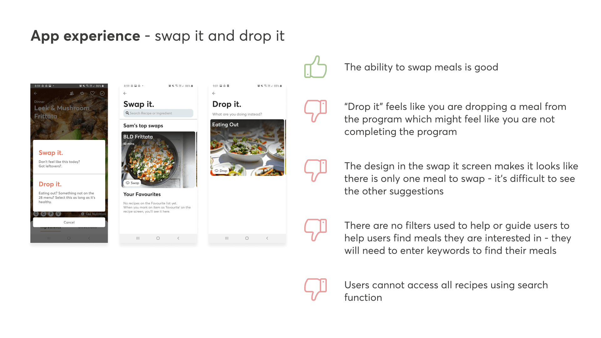
Meal planning on 28 by Sam Wood, a holistic health and nutrition platform was overwhelming for new customers as they were required to cook 21 new recipes each week, which meant sourcing new ingredients and spending hours in the kitchen.
Our goal was to understand our customers’ pain points within their first 7-day experience and figure out better ways to make their lives easier through an improved nutrition experience that would create sustainable, healthy habits.
As the sole product designer on my team, I was involved with auditing the existing mobile and web experience, leading discovery workshops, providing recommendations to improve the end-to-end experience, creating scalable components, and working with the developers to improve the UI.
My contribution
Product strategy
User research
User experience
Design system
The team
1 x CTO
1 x Product Owner
1 x Product Designer
2 x Mobile Developers
3 x Web Developers
Year
2022
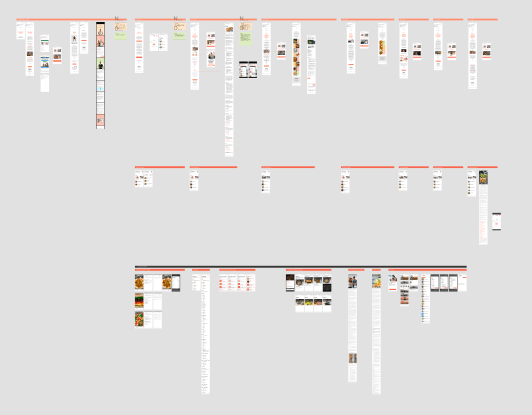
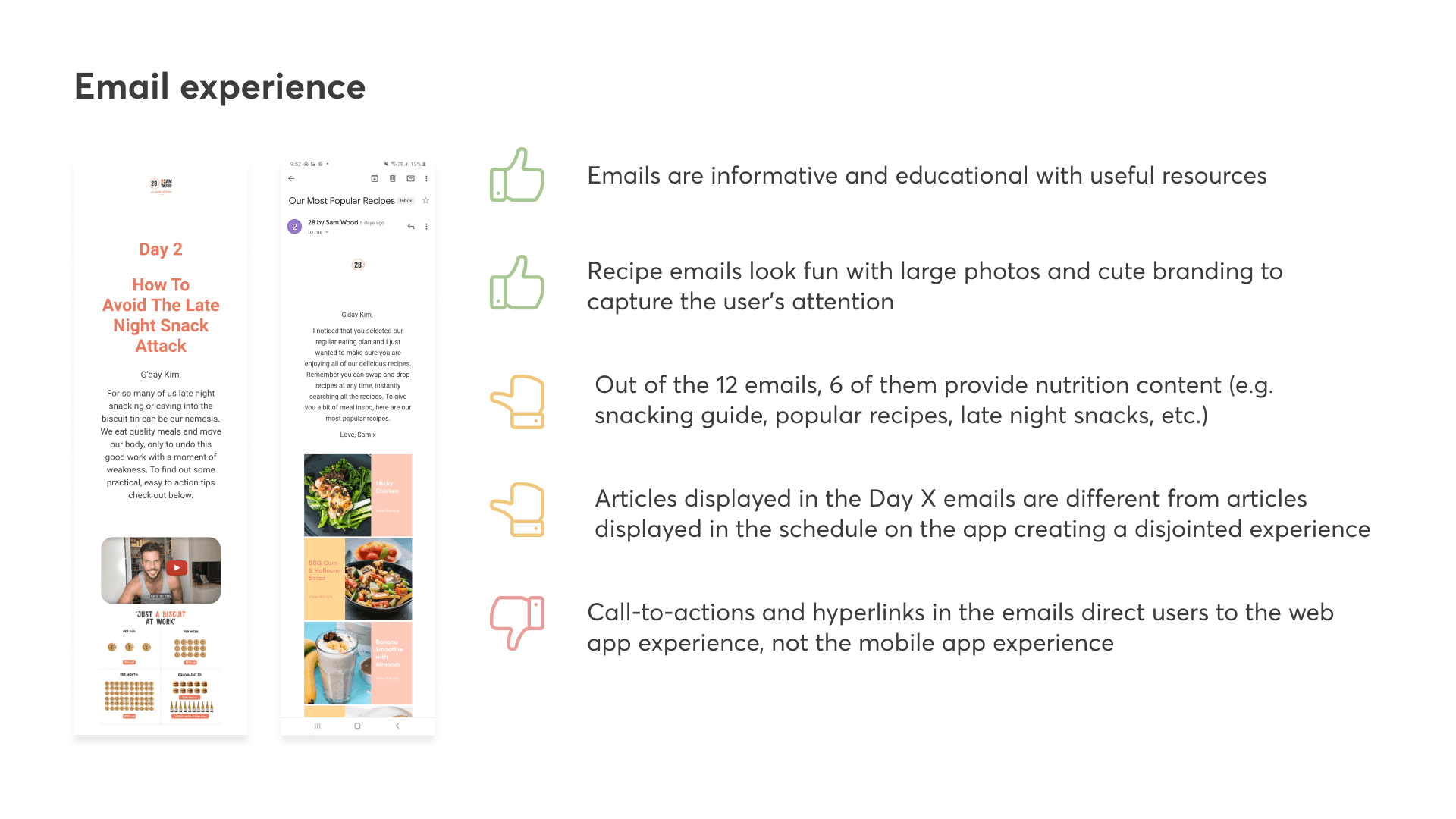
To understand the current experience, I documented the customer’s first 7-day product and email experience on mobile and desktop.
From this activity, we discovered discrepancies in the features across the different platforms (e.g. Android, iOS, and Web) and identified many inconsistent components. Customer pain points and opportunities were highlighted across the entire journey.
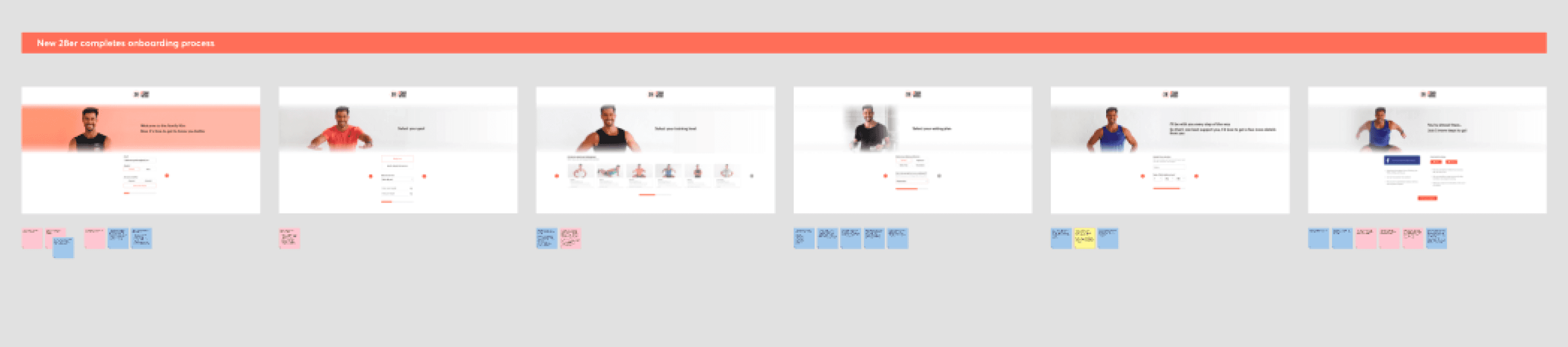
Desktop - Onboarding Experience Screens
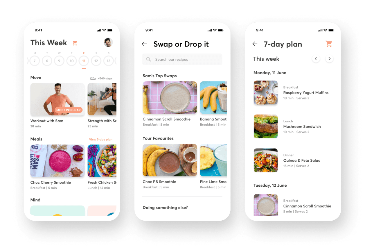
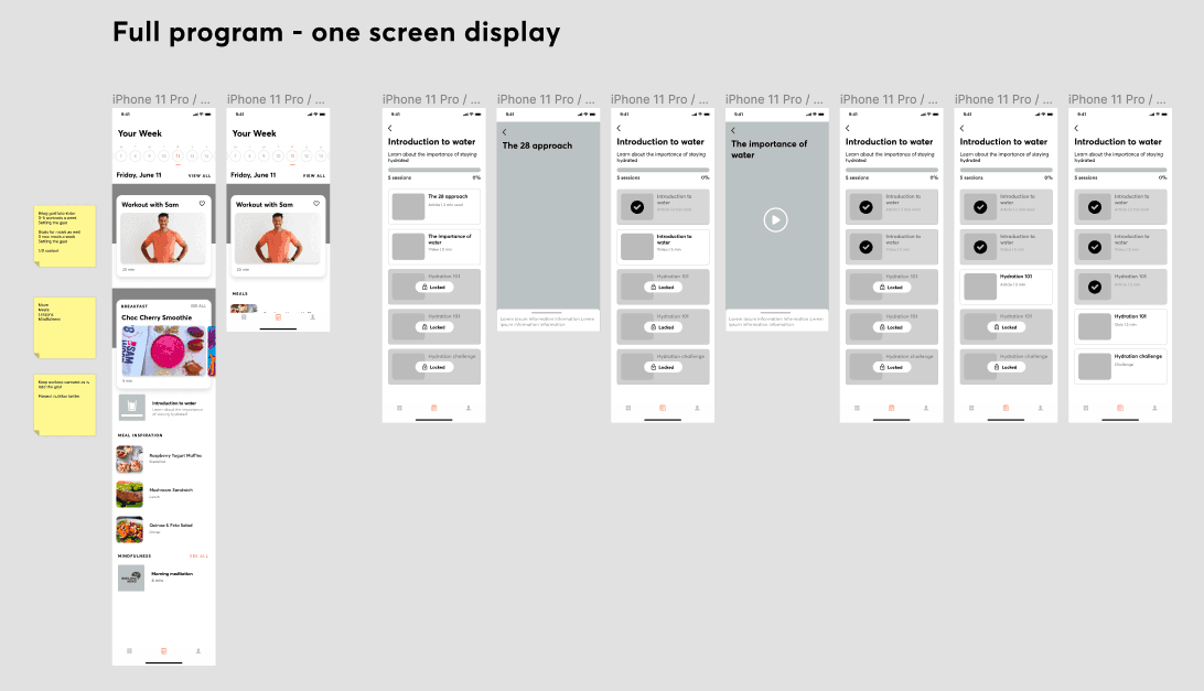
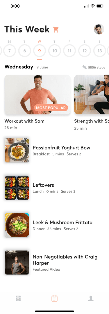
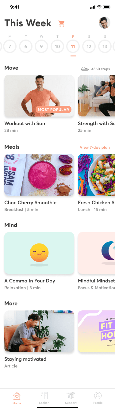
Mobile - 7 Day Experience Screens
After documenting the existing journey, I shared the pain points and opportunities with key stakeholders in the organisation including our nutritionists, the CEO, Sam Wood, CTO, and product owner. I hosted a 1-hour workshop to brainstorm ideas and solutions to enhance the 28 by Sam Wood nutrition experience.
Creating initial mockups
With the many ideas that came out of the workshop, I started creating some initial mockups to test out some concepts and then shared these high level designs with my CTO and product owner.
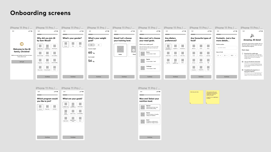
Concept: Enhancing onboarding screens
Concept: Unlocking content and articles
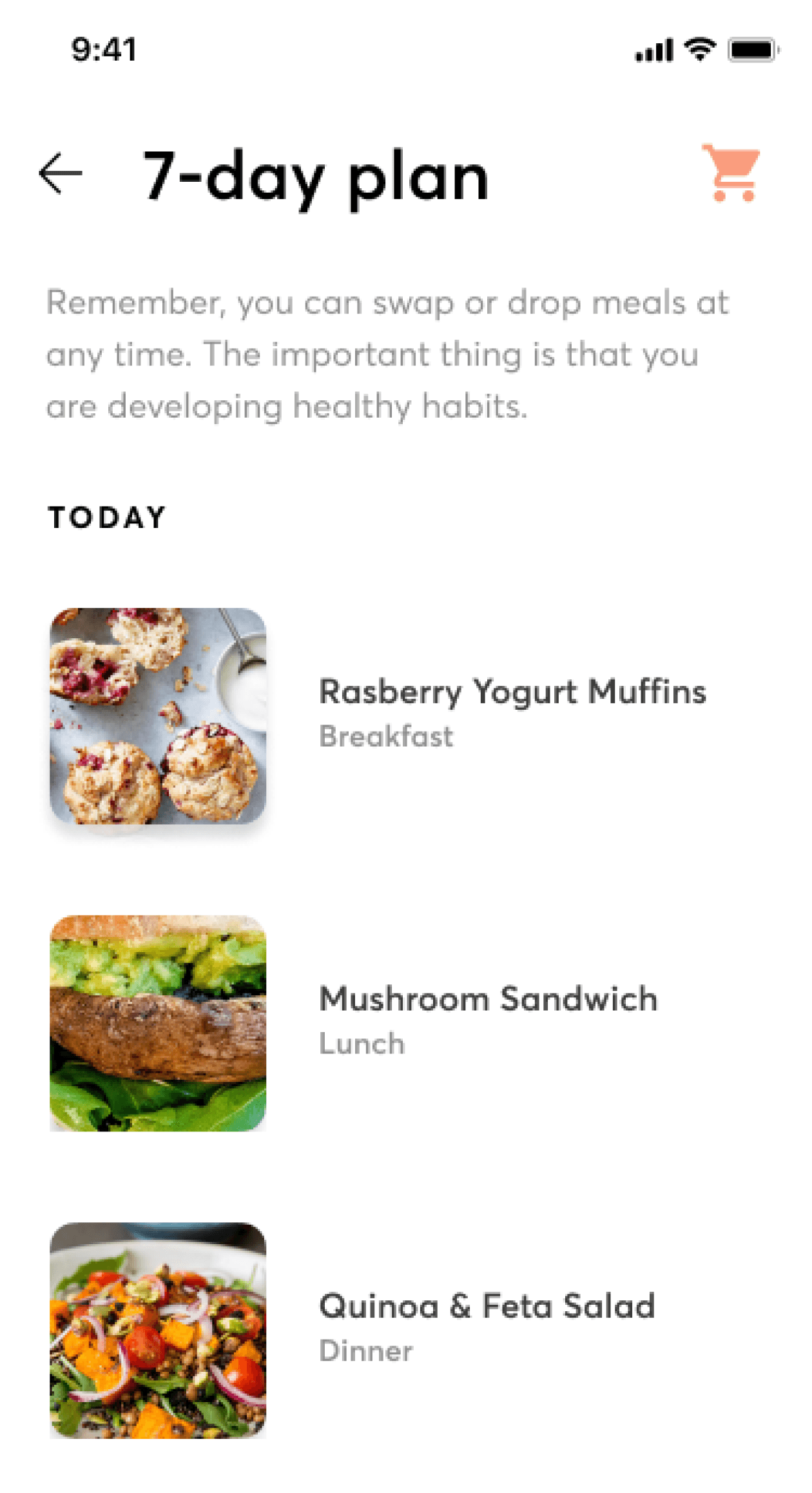
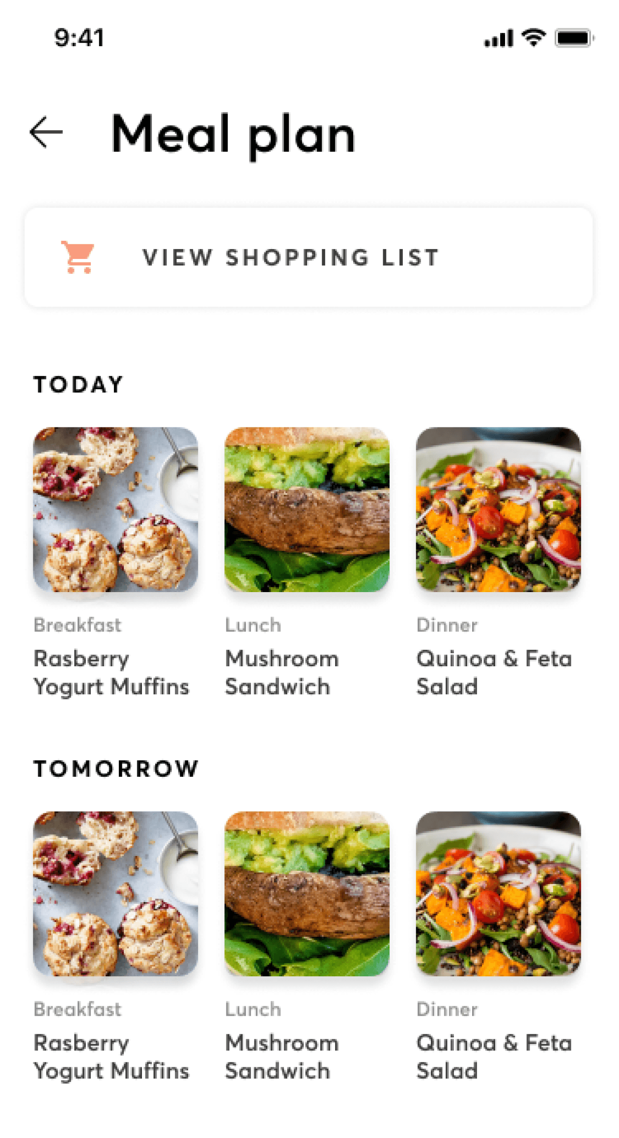
Concept: 7-day meal plan
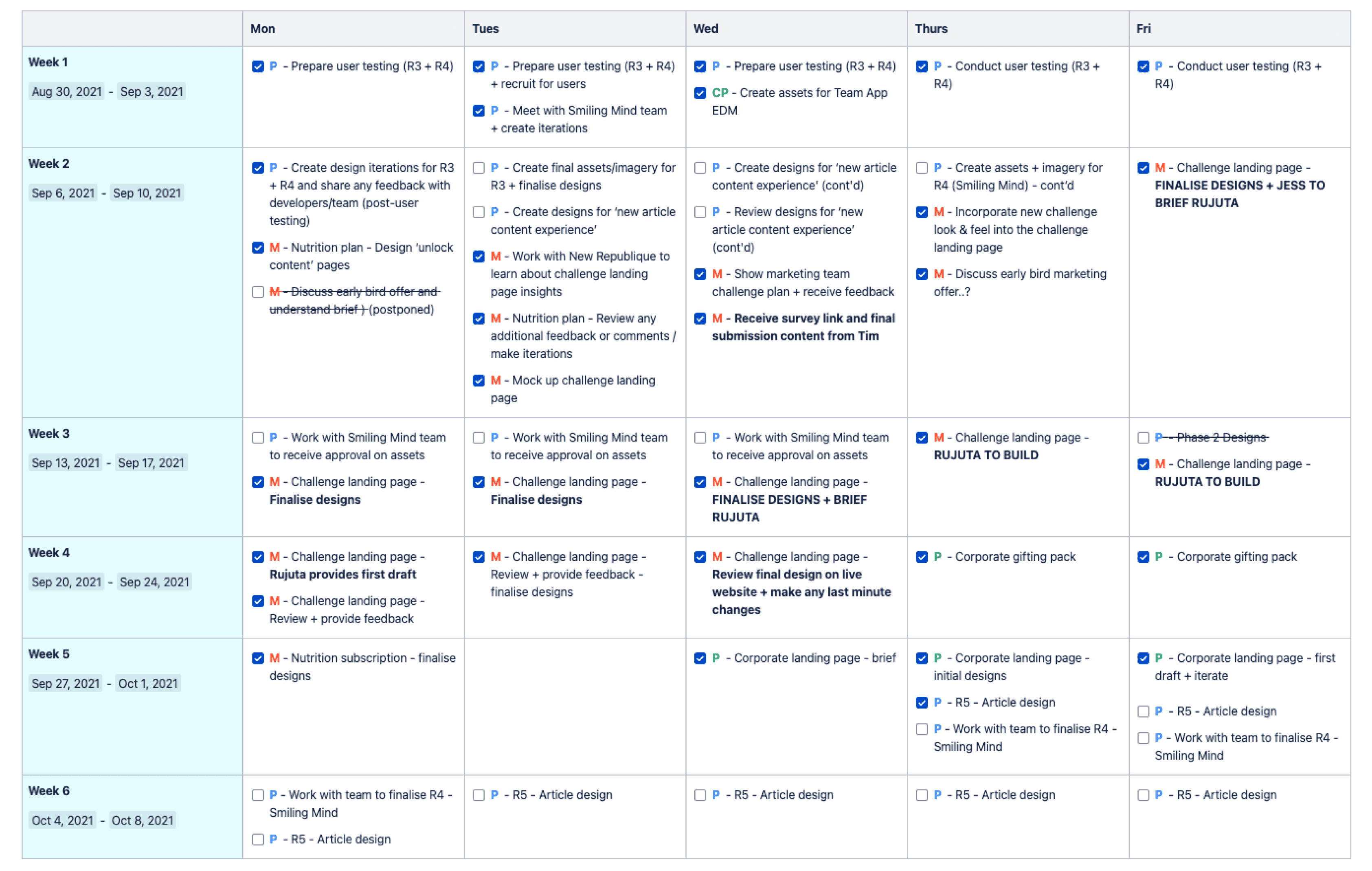
After agreeing on the scope of work and deliverables, I created a high level design plan and a detailed design plan that would be actioned for the next 6 weeks. Having a plan shared on Confluence helped keep everyone aligned on what we planned to design and develop during the upcoming sprints.
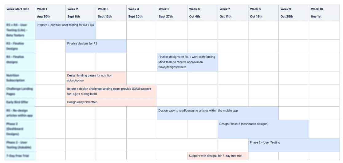
High level design plan
Detailed design plan (Blurred out due to confidential information)
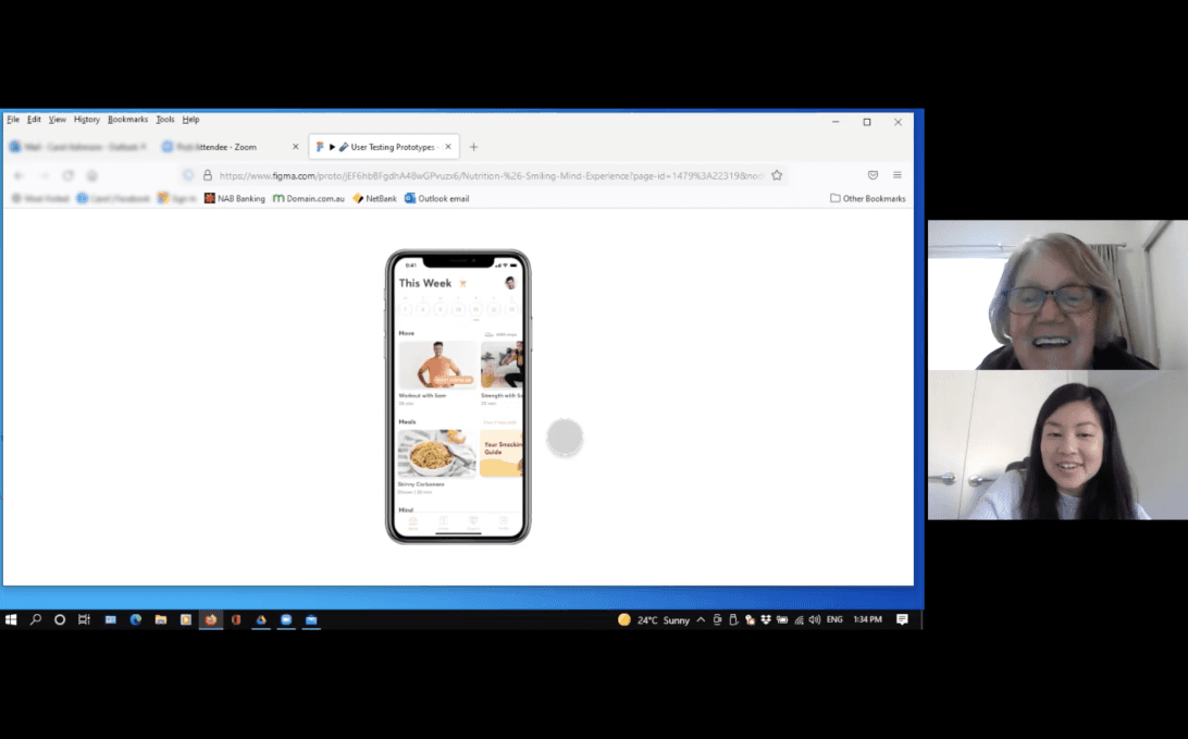
Conducting virtual customer testing sessions
To ensure our designs were intuitive and easy to use, we conducted six 45-minute virtual customer testing sessions. I recruited users from our beta testing group as well as Askable (online user testing platform) to get a mix of current customer and non-28 by Sam Wood customers.
Customer insights
After conducting the sessions, I synthesised the findings to discover patterns and opportunities across the feedback.
Overall, customers found the new experience easy to use.
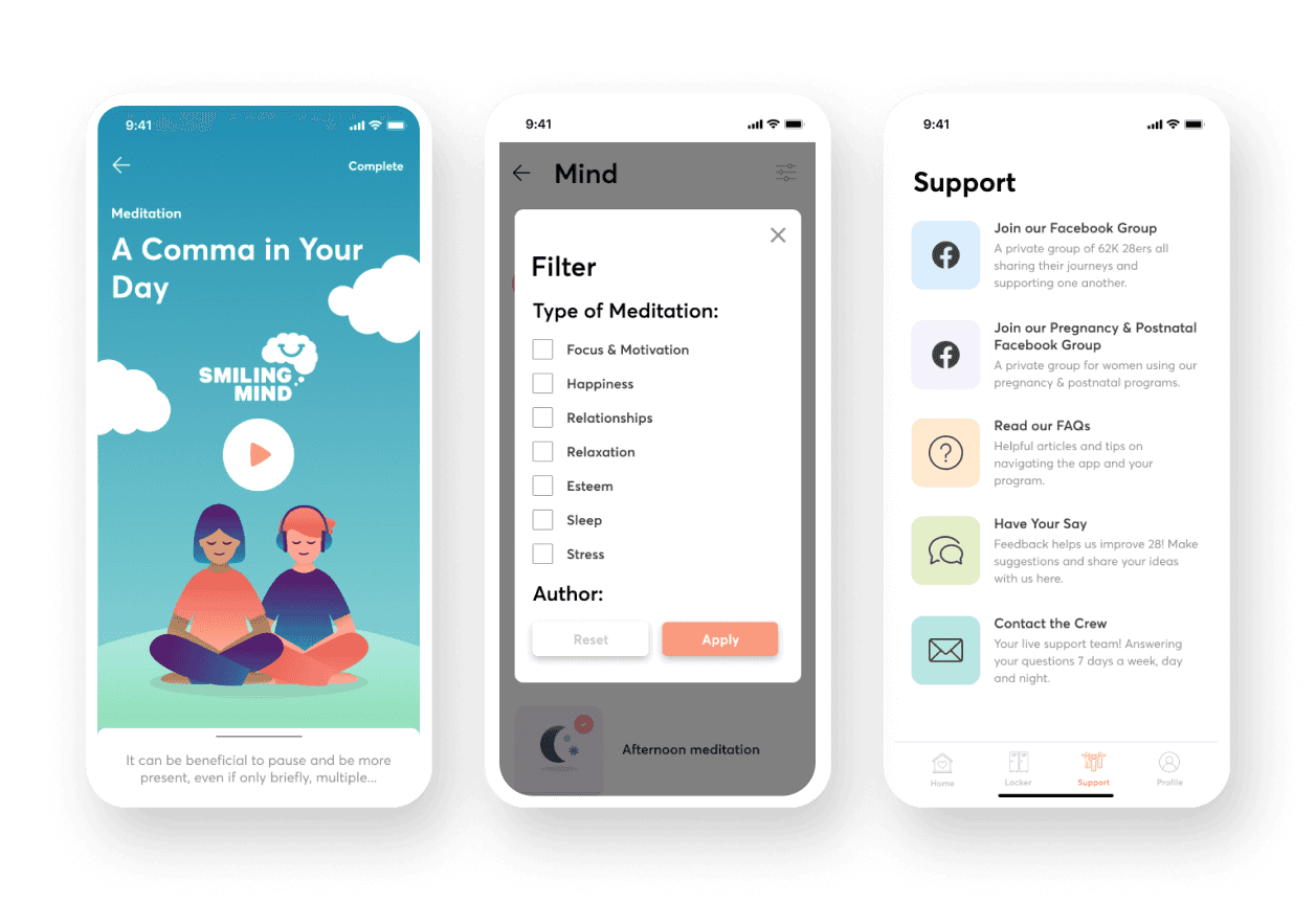
With the new meditations, the colours and brand looked calm and welcoming. However, the new guides section was too text-heavy and needed more imagery to break up the content. Customers were also confused at some of the icons used.
From these insights, we were able to validate some of our assumptions and began iterating the designs to ensure a better customer experience.
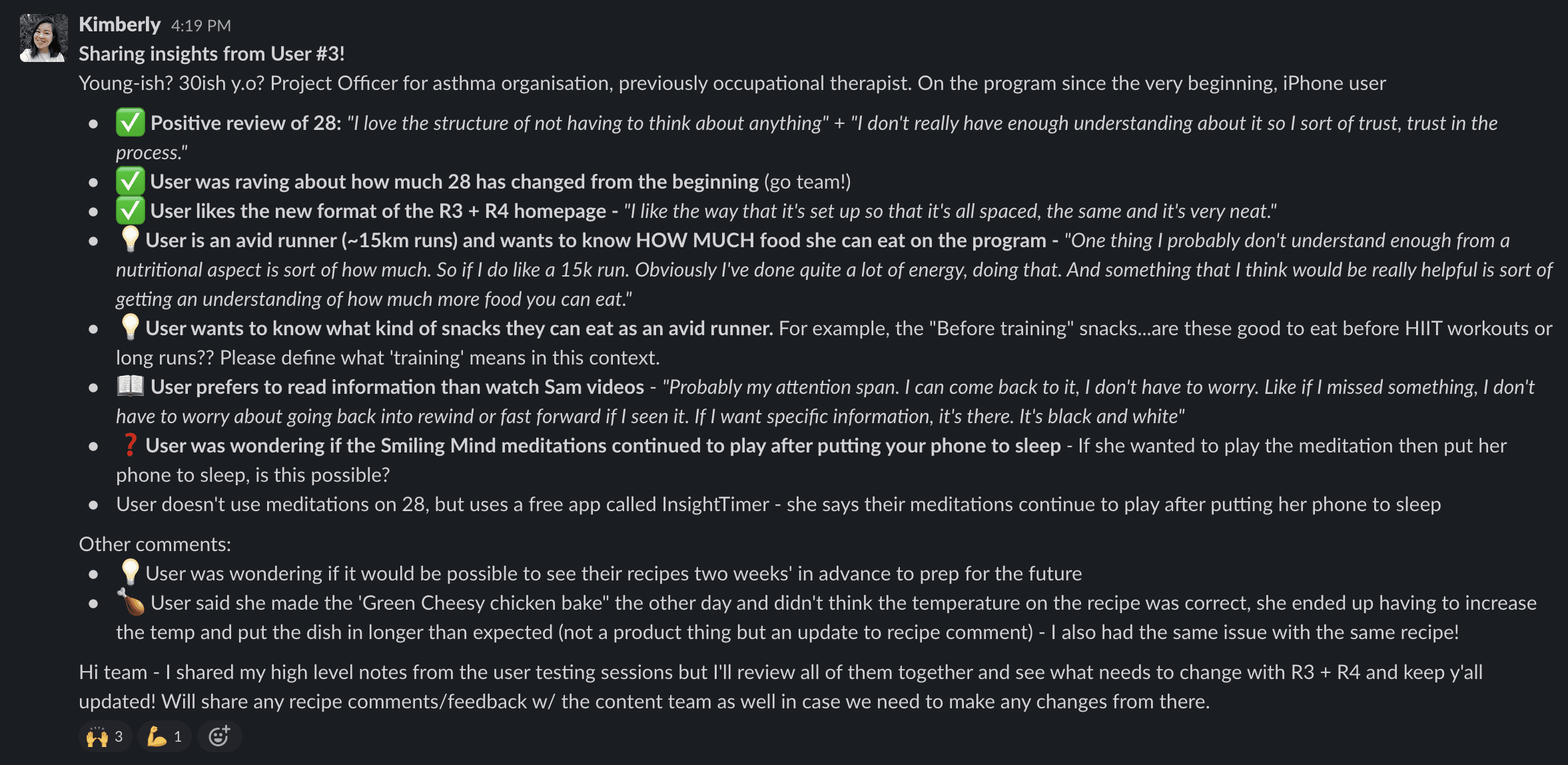
Customer insights summary (one participant) - Sharing quick insights for our product team via Slack
While we were focusing on designing for the nutrition experience, we also had to consider other factors that changed the project timeline.
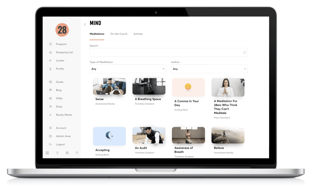
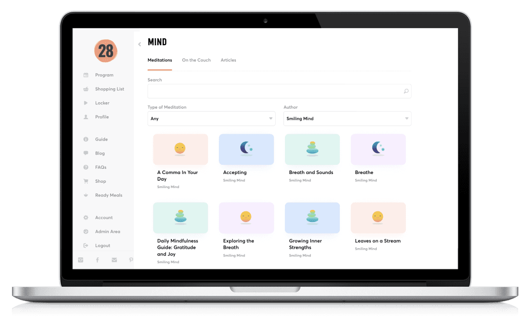
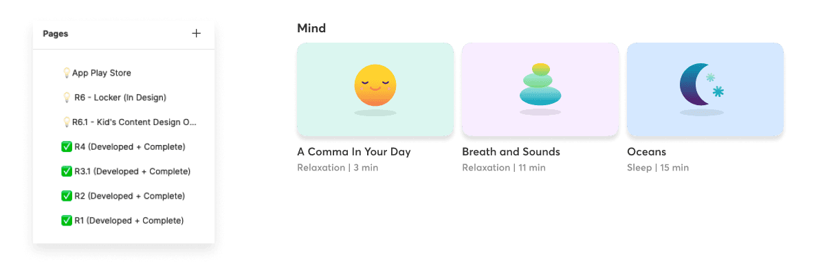
During this time, we also began a new partnership with Smiling Mind to provide meditations in our program. There were also multiple customer requests to help make the workouts section easier to understand so we displayed a new help video to educate our customers.
With the additional new requirements, we ended up splitting up the Figma pages into separate releases which allowed the developers to focus on each specific flow better.
Creating iterations and final designs
With the feedback from our customers, stakeholders, and product team, I iterated the designs to complete our enhanced nutrition experience.
Although adding new requirements impacted our estimated timelines, we ended up creating a much consistent and holistic experience for our customers (a silver lining!)
Changing a square module to a rectangular one (e.g. recipe image) seems like a ‘simple update’ but it may mean the existing assets may not work for the new designs, so ensure you have the right images to cater for the new designs.
Displaying extra descriptive content may be useful, but ensure you test it out with your customers to see whether anyone engages with the content. If not, then remove the unnecessary text.
Although we designed for mobile-first, we also had a web app (for desktop and tablet) that needed to be considered as well.
Reduce development time by considering native functionality throughout the design process instead of creating new functionality and components.
New designs in mockups and prototypes may look ‘nice’ but ensure you test out real scenarios to see what the ‘new content’ looks like against the ‘old content’.