
The existing configuration tool to customise a print product was not user-friendly or intuitive. Our design challenge was to enhance the end-to-end experience for ordering and customising over 400 print products using Officeworks’ Print, Copy and Create’s online configuration tool.
I worked in a team of 5 UX/UI designers on this major digital transformation project.
As a UX Designer on the project, I was responsible for designing and mapping out 2 streams of work (the Template and Upload journey), working closely with our key stakeholders to ensure alignment across business objectives, leading customer testing sessions, working closely with our UI designer to create a seamless experience, and providing mentorship to our UX graduate.
My contribution
User flows
Wireframing
User testing
Web design
Mobile design
The team
1 x UX Design Lead
2 x UX Designers
1 x UI Designer
1 x UX Graduate
1 x Content Designer
1 x Business Analyst
5 x Engineers
Year
2019
Existing experience audit
Review the current state functionality and test out different features to understand the current pain points and opportunities throughout the product configuration experience
Understand business goals
Work with stakeholders and third-party vendors to understand the primary purpose of the features and core functionality
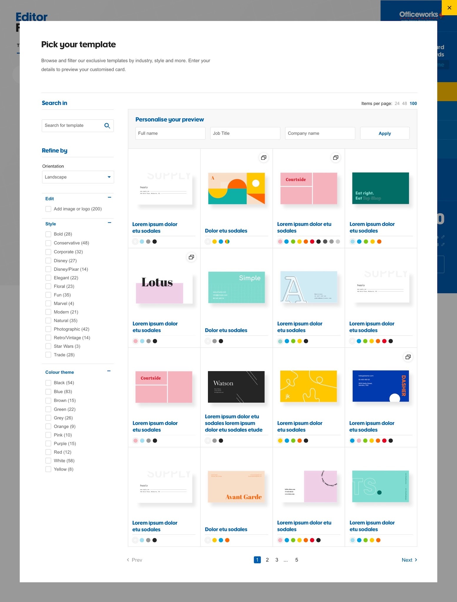
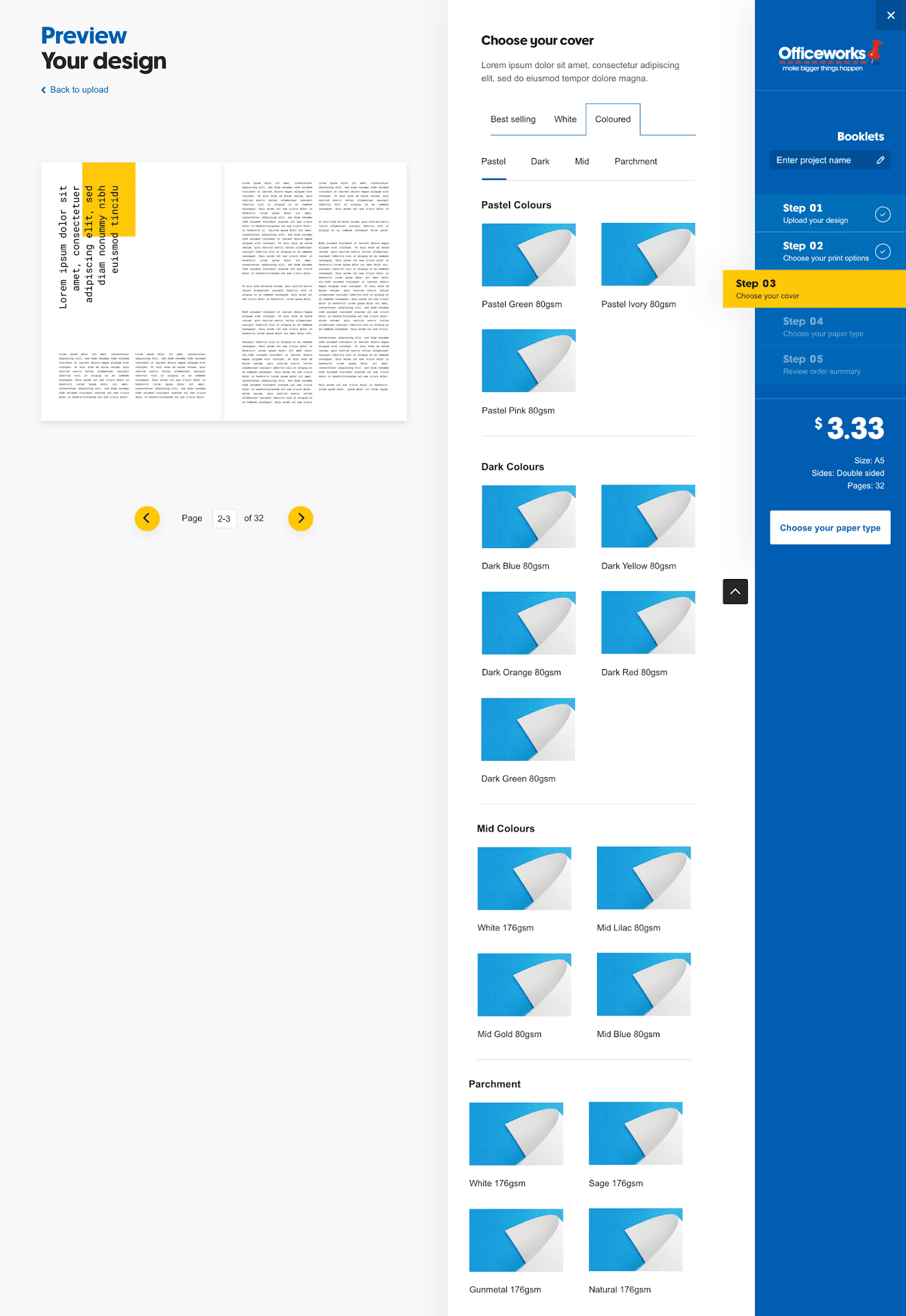
Initial wireframing
Create initial wireframes, re-usable components, and page layouts on Sketch to be iterated
Bi-weekly design jams
Facilitate bi-weekly "design jam" sessions with stakeholders across the business to receive feedback for iteration of the designs. Teams include merchant teams, product template teams, customer experience teams, and third-party vendors.
Tech feasibility
Engage with product and tech team (e.g. business analysts, front and back-end developers, third-party vendors) to ensure alignment across business requirements and tech feasibility
Customer testing sessions
Organise and conduct multiple rounds of 1:1 customer testing sessions via Askable and Lookback. Recruit, prepare, and moderate customer testing sessions.
UX and UI collaboration
Handover wireframes to UI designer to create high-fidelity designs
MVP + future scope recommendations
Provide recommendations for foundation scope as well as post-foundation recommendations to be added to the backlog
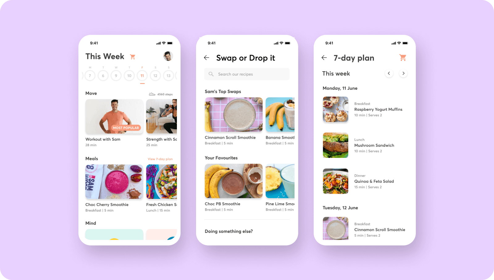
Mobile designs
Create mobile flows and designs to be used for future backlog (as this project was focussed on the desktop journey)
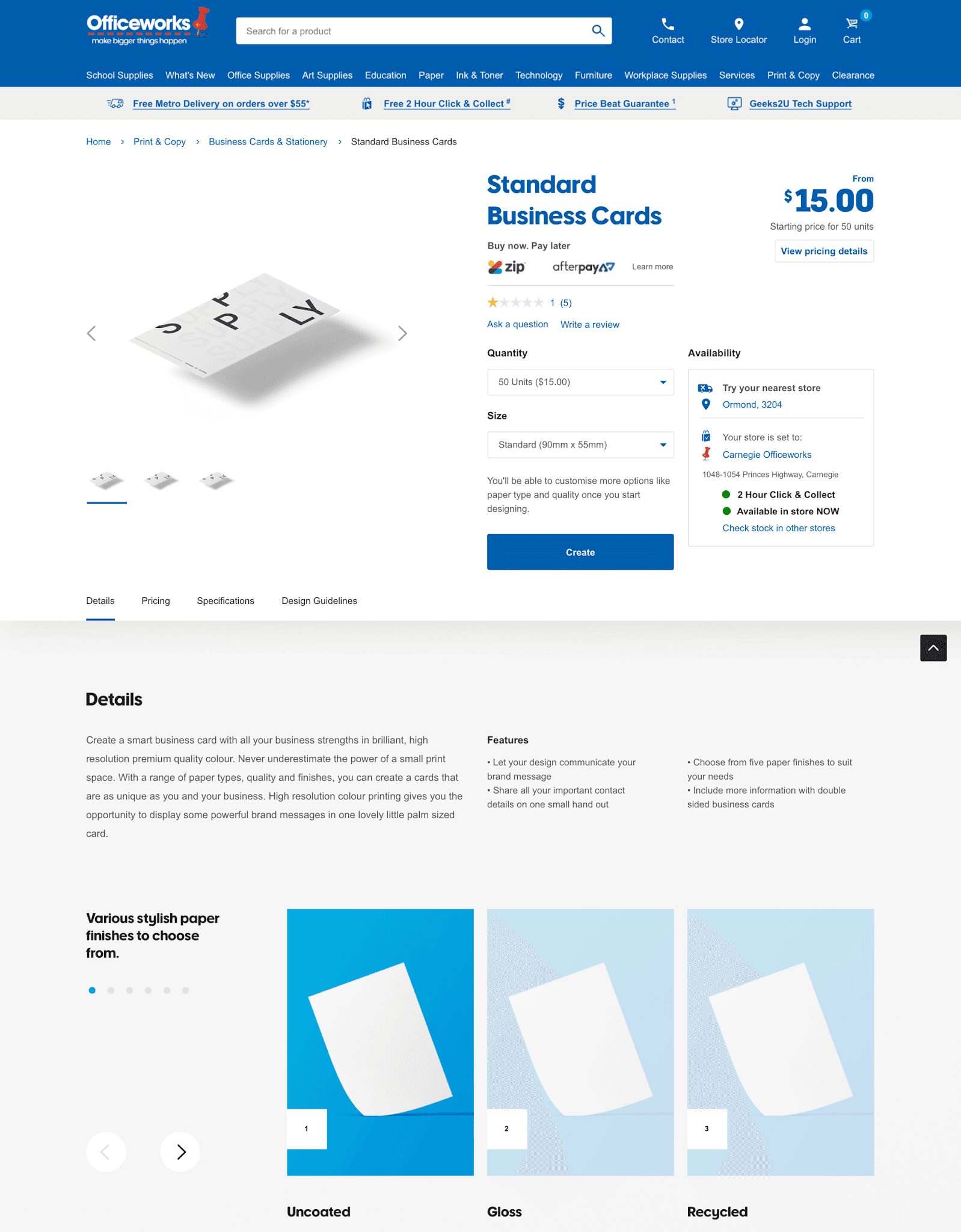
Make it easy for customers to access pricing
Customers wanted to understand the pricing clearly and whether they would receive discounts when purchasing products in bulk, so we developed a quick short link for them to access the pricing table as quickly as possible.
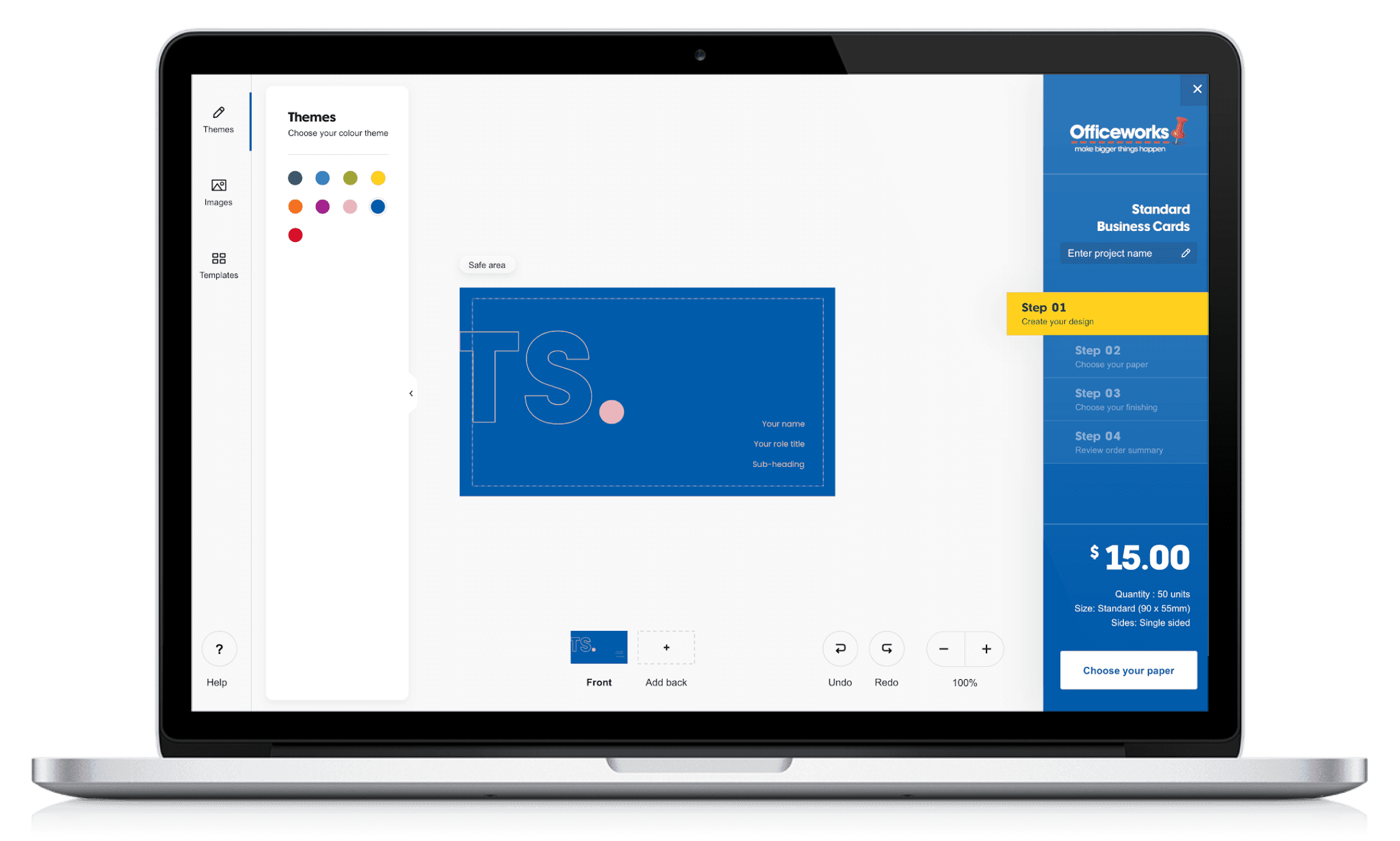
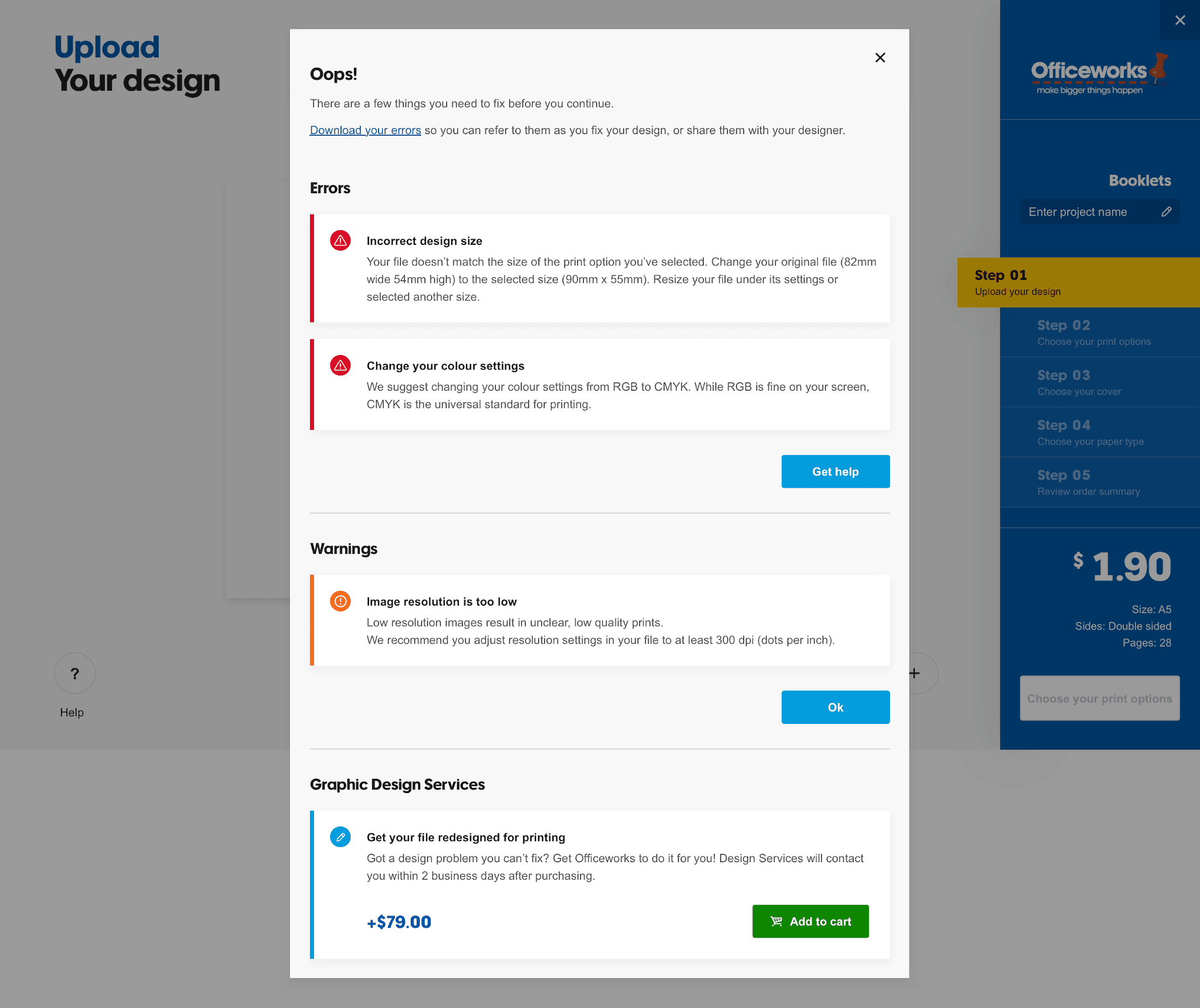
Design clear, large, prominent buttons and icons
Some customers missed specific action icons such as "Crop" or "Delete" because the icons and text were too small on the configuration tool so increasing both the icon size and text made a difference in the next round of customer testing.
Design within the timelines, but also amend where needed
A detailed design plan was mapped out with specific features set out for each sprint. However, when designing for the different features, we discovered new requirements that needed to be accounted for in the journey so this pushed out the timeline.
Test existing functionality and more
Although we designed for three main journeys, there were products that were bespoke and contained different customisation features which made it more difficult for us to design for these special instances. The best way to find these hidden features was to test out the existing online tool and click around.
Collaborate with key stakeholders early on
When designing the calendar journey, we realised it would have been better to collaborate with the Templates team early on as they had insider knowledge on additional product and tech constraints as well as custom features we should design for.
Consider designing for mobile early on
As this was mainly a desktop-focussed product, we only began designing for the mobile journey close to the end of the project. However, we realised the mobile and desktop journey was completely different so the mobile journey took much longer to design for than expected.